Book Cover Battle: Dune vs. The Hunger Games – Visual Storytelling Showdown
Forget blurbs – we pit two iconic book covers against each other to see which truly captures its literary soul and which falls flat.
They say never judge a book by its cover, but let's be real: we all do. A book's jacket is its first handshake, its silent pitch, and in today's crowded literary landscape, it's more crucial than ever. A truly masterful cover doesn't just display a title; it evokes a mood, hints at a world, and beckons the reader into its pages. But which covers truly deliver? Today, we're taking two titans from the trending charts – Dune and The Hunger Games – and mercilessly judging their visual appeal. This isn't about the brilliance of the prose (which is undeniable for both, mostly), but about the artistry that frames it.
Unpacking Iconic Book Covers: Dune vs. Hunger Games
For those endlessly scrolling for the next great read or debating literary marketing, understanding what makes a cover design work is paramount. This deep dive into two powerhouse titles will dissect: * The raw power of visual branding in literature. * How Frank Herbert's Dune cover delivers subtle, epic gravitas. * Why Suzanne Collins' The Hunger Games cover became an instant cultural touchstone. * The delicate balance between intrigue and blatant spoiler. * Which book cover truly earned its place in the pantheon of design.
The Arrakis Aesthetic: Dune by Frank Herbert
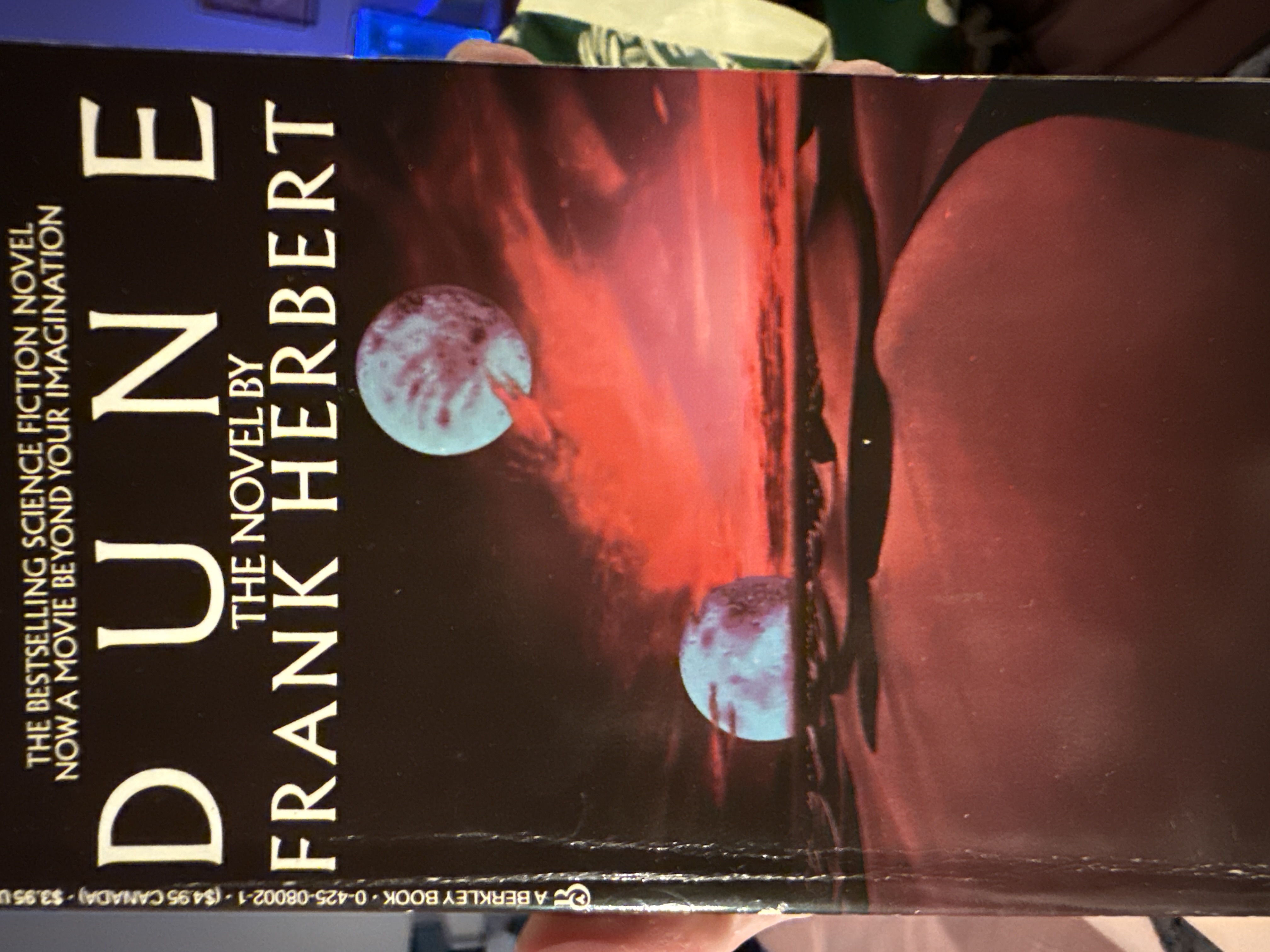
 Frank Herbert's seminal sci-fi epic, Dune, has graced countless editions, but the trending version often features a stark, minimalist landscape. We're talking sweeping desert dunes, perhaps a distant, foreboding structure, or the subtle hint of a colossal sandworm – all rendered in muted, earthy tones. It’s a design philosophy that screams 'serious literature' rather than 'pulp sci-fi adventure.' It doesn't spoon-feed you action; it promises grandeur and a desolate, powerful world.
The Mockingjay's Glare: The Hunger Games by Suzanne Collins
 Then we have The Hunger Games, a YA phenomenon that shattered expectations and birthed a cinematic franchise. Its most iconic cover is an immediate punch to the gut: the fiery Mockingjay pin, a symbol of rebellion, set against a dark, almost charred background. It’s direct, potent, and utterly unforgettable. There's no ambiguity here; this cover promises high stakes, struggle, and a spark of defiance. For more insights on this YA titan, check out our recent take on The Hunger Games vs. Goblet of Fire: YA's Fiercest Battle.
The Ultimate Cover Clash: Dimensions of Design
1. Thematic Depth & Mood Capture
The greatest covers don't just depict; they emote. They bottle the very essence of the story. Dune: This cover, with its vast, empty spaces and almost spiritual minimalism, perfectly encapsulates the epic scale, ecological themes, and the profound sense of isolation and destiny that permeates Arrakis. It's a promise of introspection and grand, slow-burn conflict. It doesn't spoil; it invites contemplation. It’s serious, weighty, and utterly fitting for the complex politics and philosophy within. Score: 5/5
The Hunger Games: The Mockingjay pin, famously tarnished, speaks volumes. It's rebellion, a broken system, and a glimmer of hope all rolled into one. The fiery backdrop screams danger, oppression, and the brutal arena. It nails the urgent, high-stakes dystopian mood of the book with surgical precision. It instantly communicates 'dystopian, young adult, action.' Score: 4/5
2. Visual Storytelling & Symbolism
How much does the cover tell without giving away too much? And how resonant are its chosen symbols? Dune: The beauty of the classic Dune cover lies in its subtle foreshadowing. The endless sand implies the Fremen, the worms, the Spice. The muted palette suggests the harshness of life on Arrakis. It's abstract enough to pique curiosity, yet specific enough to be undeniably Dune. It leans into the mystique, forcing you to engage. For more on Herbert's world-building, see Foundational Debuts: Herbert's Dune Battles Tolkien's Hobbit. Score: 4/5
The Hunger Games: The Mockingjay is iconic, no doubt. It's a powerful symbol within the book itself, and placing it front and center was a stroke of genius. It tells a clear story: something precious, broken, yet resilient. However, it's also quite literal, almost a logo for the series rather than an abstract piece of art. It’s effective, but perhaps a touch less sophisticated in its visual rhetoric than Dune's understated grandeur. Score: 4/5
3. Enduring Impact & Timelessness
Which cover design has the legs to outlast fleeting trends and remain a classic in its own right? Dune: The minimalist, often abstract Dune cover designs possess an almost art-house quality. They don't scream "2026"; they simply are. Their elegance ensures they'll be reprinted for generations, adaptable to new interpretations while retaining their core identity. It's a timeless vision, much like the book itself. Score: 5/5
The Hunger Games: While instantly recognizable and incredibly successful, the Hunger Games cover, with its strong branding and slightly more commercial aesthetic, feels more tied to the era of its explosive popularity. It's potent, yes, but does it possess the same kind of universal, genre-defying artistic weight as Dune's more painterly approach? I'd argue not quite. It's a fantastic brand image, but less of a timeless art piece. Score: 3/5
Editor's Verdict
This was a tougher fight than anticipated, but a clear victor emerges. While The Hunger Games cover is a masterclass in immediate impact and brand recognition, Dune's understated, profound visual storytelling ultimately takes the crown. The Dune cover isn't just an advertisement; it's an invitation to a grand, challenging literary experience, reflecting the book's monumental scope with elegant precision. It's the kind of cover that reveals more layers the longer you gaze upon it, much like the story it protects.
Winner: Dune Total Score: Dune 14/15, The Hunger Games 11/15
Liked this head-to-head? Give it a like and let us know your pick!
FAQ
How important is a book cover in today's digital age?
Incredibly important. While physical browsing is less common, a compelling digital thumbnail or social media image still acts as the first visual hook, influencing clicks, shares, and ultimately, purchase decisions.
Do movie tie-in covers help or hurt a book's long-term appeal?
While movie tie-ins can provide a temporary sales boost by capitalizing on film hype, they often detract from a book's original artistic identity and can date the edition quickly, rarely matching the enduring appeal of original, well-designed covers.
What makes a book cover "timeless"?
Timeless book covers often feature strong conceptual art, clear typography, and a design that transcends fleeting graphic trends, focusing instead on conveying the core essence and mood of the book in a way that remains visually compelling across decades.